Question 10
Use the bar graph to answer the following questions:
- On which item does Imran’s family spend the most and the second most?
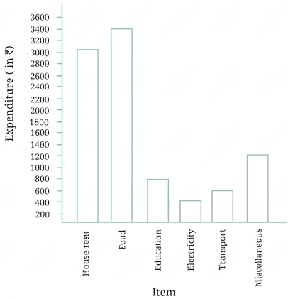
- A bar graph visually represents quantities through the heights of bars corresponding to each category.
- To find the items with the highest and second highest spending, compare the values or bar heights for each expenditure category from the graph:
1 On which item does Imran’s family spend the most and the second most?
Step 1 · Find the Highest Expenditure
Read the expenditure for each item from the given bar graph: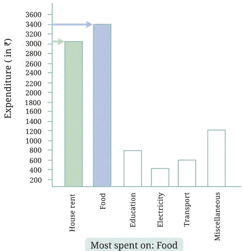
Comparing all the values:
The largest expenditure is , which corresponds to Food.
Step 2 · Find the Second Highest Expenditure
Comparing the remaining expenditures ():
The highest among the remaining values is , which corresponds to House rent.
1 Most: Food, Second most: House rent
- Scale Misreading: Misreading intermediate values on the vertical axis (e.g., confusing with ).
- Order Inversion: Listing the items in ascending order instead of identifying the top two highest expenditures.
More questions in IT
To figure out the most popular game in their class, what should Navya and Naresh do? Can you help them?
Based on the pictograph of 'Modes of Travelling', answer the following questions:
- Which mode of travel is used by the most number of students?
- Which mode of travel is used by the least number of students?
Jarina and Sangita collected data on how many students were present in each class (shown in the table on the previous page).
Q. If they want to show their data through a pictograph, where they also use one symbol ☺ for each student, as Lakhanpal did, what are the challenges they might face?
What could be the problems faced in preparing such a pictograph, if the total number of students present in a class is 33 or 27?
Answer the following questions using the bar graph:
- In Class 2, _________ students were absent that day.
Answer the following questions using the bar graph:
- In which class were the maximum number of students absent?
Answer the following questions using the bar graph:
- Which class had full attendance that day? _________
On the basis of this bar graph, what may be a few questions you may ask your friends?
How much did the population of India increase over 50 years?
How much did the population increase in each decade?
Use the bar graph to answer the following questions:
- On which item does Imran’s family spend the most and the second most?
Use the bar graph to answer the following questions:
- Is the cost of electricity about one-half the cost of education?
Use the bar graph to answer the following questions:
- Is the cost of education less than one-fourth the cost of food?
- The following pictograph shows the number of tractors in five different villages.
Observe the pictograph and answer the following questions—
a. Which village has the smallest number of tractors?
b. Which village has the most tractors?
c. How many more tractors does Village C have than Village B?
d. Komal says, "Village D has half the number of tractors as Village E." Is she right?
- The number of girl students in each class of a school is depicted by the pictograph:
Observe this pictograph and answer the following questions:
a. Which class has the least number of girl students?
b. What is the difference between the number of girls in Classes 5 and 6?
c. If two more girls were admitted in Class 2, how would the graph change?
d. How many girls are there in Class 7?