Question 28
Context: Look at the graph showing the number of worldwide rocket launches by different organisations.
Q. Notice how the graph is organised, what scale is used, and what patterns the data shows.
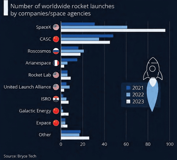
- The visual is a grouped horizontal bar graph displaying the number of rocket launches by various worldwide organisations across three consecutive years (, , and ).
- To understand the graph fully, we examine:
- Organisation: How categories, axes, and color codings are arranged.
- Scale: The starting value, range, and step increments on the numerical axis.
- Patterns: Key trends, comparisons, and changes in launch counts over time.
Step 1 · Graph Organisation
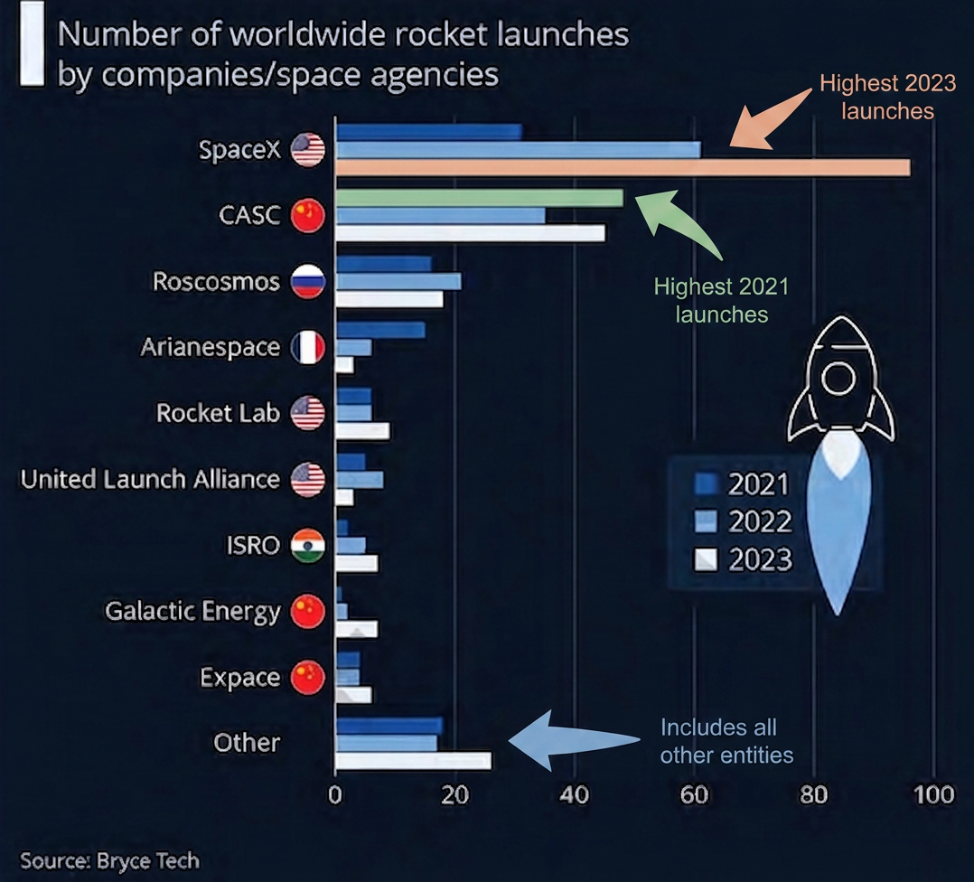
- Layout: It is a horizontal grouped bar chart.
- Vertical Axis (Left): Lists the different space companies and agencies.
- Horizontal Axis (Bottom): Measures the number of launches.
- Color Legend: Each organisation has three bars representing different years:
- Dark Blue:
- Medium Blue:
- Light Blue:
Step 2 · Scale Used
- The horizontal axis starts at and extends up to launches.
- Major grid marks: Spaced at intervals of launches ().
- Minor grid marks: Indicate increments of launches.
Step 3 · Patterns in the Data
- Highest Volume & Growth: SpaceX had the highest number of launches by far, with a substantial increase each year.
- Second Highest: CASC also showed consistent growth over the three-year period.
- Stable Trends: Roscosmos and United Launch Alliance (ULA) maintained relatively steady launch counts.
- Decreasing Trend: Arianespace experienced a noticeable drop in launches.
- Emerging Growth: Rocket Lab, ISRO, Galactic Energy, and ExPace showed upward trends.
- Overall Pattern: The total number of worldwide launches increased significantly from to .
- Organisation: Horizontal grouped bar chart with organisations on the left, number of launches at the bottom, and colors representing , , and .
- Scale: Horizontal axis runs from to launches with major increments of and minor increments of .
- Patterns: SpaceX leads with rapid year-on-year growth, CASC is second, and total worldwide rocket launches generally trended upward from to .
- Axis Confusion: Inverting the axes by reading the vertical axis as numerical values instead of organisational categories.
- Legend Misinterpretation: Confusing the shades of blue representing , , and , which can invert the perceived trend of an organisation over time.
- Overlooking Subdivisions: Reading only the major grid marks () while ignoring the half-way marks (), leading to imprecise value estimates.
More questions in IT
Your teacher tells you that they are meeting two of their childhood friends this evening. One is 5 feet tall and the other is 6 feet tall. What is your guess as to each friend's gender based on this information?
Which of the following are statistical questions?
(a) What is the price of a tennis ball in India?
(b) How old are the dogs that live on this street?
(c) What fraction of the students in your class like walking up a hill?
(d) Do you like reading?
(e) Approximately how many bricks are in this wall?
(f) Who was the best bowler in the match yesterday?
(g) What was the rainfall pattern in Barmer last year?
The runs scored by Shubman and Yashasvi in a cricket series are given in the table below. Who do you think performed better?
Context: The table shows the runs scored by Shubman and Yashasvi in a series of matches. Vaishnavi says, "Here, Shubman performed better since his total is 110 runs, while Yashasvi's total is 96 runs".
Q. What do you think of Vaishnavi's statement?
Can a single number act as a representative of a group of numbers? For example, can we represent Shubman's or Yashasvi's batting in this series with one number? Discuss.
Know Your Onions!
The table shows the monthly price of onions, in rupees per kilogram (kg), at two towns. Where are onions costlier, according to you?
Context: The table shows the monthly price of onions, in rupees per kilogram (kg), at two towns, Yahapur and Wahapur.
Q. Can you think of any other ways to compare the data?
Context: The dot plots show the monthly price of onions in Yahapur and Wahapur, as compared to the tables of monthly prices.
Q. Does this visualisation capture all the data presented in the tables earlier?
Context: The dot plots show the monthly price of onions in Yahapur and Wahapur.
Q. Looking at it, can we tell the price of onions in Yahapur in the month of January?
Context: The monthly prices of onions (in ₹) at Yahapur and Wahapur are given in the tables.
Q. Find the average price of onions at Yahapur and Wahapur.
What else do you wonder about?
Context: The heights of the family members of Yaangba and Poovizhi are as follows:
Yaangba's family: 169 cm, 173 cm, 155 cm, 165 cm, 160 cm, 164 cm.
Poovizhi's family: 170 cm, 173 cm, 165 cm, 118 cm, 175 cm.
Q. Find the average height of each family. Can we say that Yaangba's family is taller than Poovizhi's family?
Context: The heights of the family members of Yaangba and Poovizhi are: Yaangba's family: 169 cm, 173 cm, 155 cm, 165 cm, 160 cm, 164 cm. Poovizhi's family: 170 cm, 173 cm, 165 cm, 118 cm, 175 cm.
Q. Can you think of any other number that can represent the data better?
Context: The heights of the family members of Yaangba and Poovizhi are: Yaangba's family: 169 cm, 173 cm, 155 cm, 165 cm, 160 cm, 164 cm. Poovizhi's family: 170 cm, 173 cm, 165 cm, 118 cm, 175 cm.
Q. In this case, does the median represent the heights of the families better than the average?
Context: Poovizhi's family heights are , , , , and .
Q. Find the mean and median in Poovizhi's data without the outlier value . What change do you notice?
Are you a bookworm?
After the summer vacation, a class teacher asked his class how many short stories they had read. Each student answered the number of stories read on a piece of paper, as shown below. Find the mean and median number of short stories read. Before calculating them, can you guess whether the mean will be less than or greater than the median?
Mark the data, the mean, and the median on the dot plot below.
Context: A class teacher asked his class how many short stories they had read. The number of stories read by each student are: 6, 8, 5, 15, 3, 0, 2, 7, 12, 40, 10, 0, 8, 5, 1.
Q. Which of the values would you consider an outlier?
Context: A class teacher asked his class how many short stories they had read. The number of stories read by each student are: 6, 8, 5, 15, 3, 0, 2, 7, 12, 40, 10, 0, 8, 5, 1.
Q. Find the mean and median in the absence of the outlier. What change do you notice?
Are We on the Same Page?
Do you read newspapers? Have you noticed how many pages a newspaper has on different days of the week — is it the same or different?
The list below shows the number of pages for a particular newspaper from Monday to Sunday: 16, 18, 20, 22, 26, 16, 10.
Mark the data, the mean, and the median on the dot plot below.
In the three examples we considered — the heights, short-stories, and newspaper pages — observe the variability in data when:
(a) the mean and median are close to each other (b) the mean and median are comparatively far apart, with (c) the mean and median are comparatively far apart, with
Discuss the effect on the mean and median when outliers are present on both sides. You may take some example data to examine and explain this.
Context: The heights of boys and girls in a Grade 5 class are shown in the dot plots on the previous page, with a whole class mean of .
Q. How many students are taller than the class' average height?
Context: The heights of boys and girls in a Grade 5 class are shown in the dot plots on the previous page, with a whole class mean of 144.4 cm.
Q. How many boys are taller than the class' average height?
Compare the heights of the two sections. Share your observations.
Context: Refer to the double column graph showing monthly onion prices in Yahapur and Wahapur.
Q. What is the scale used in this graph?
Context: Refer to the double column graph showing monthly onion prices in Yahapur and Wahapur.
Q. Is it now easier to compare month-wise prices in both places?
Context: Look at the graph showing the number of worldwide rocket launches by different organisations.
Q. Share your observations (you may take the teacher's help to identify the countries these organisations belong to).
Context: Look at the graph showing the number of worldwide rocket launches by different organisations.
Q. Notice how the graph is organised, what scale is used, and what patterns the data shows.
Identify which of the following statements can be justified using this data.
(a) All organisations launched more rockets than the previous years.
(b) Only an organisation from the USA launched more than 50 rockets in a single year.
(c) The total number of rockets launched by France in all 3 years is less than 40.
(d) The average number of rockets launched by CASC in these 3 years is around 40.
(e) ISRO launched more rockets than Galactic Energy in these 3 years.
(f) Russia launched more than 60 rockets in these 3 years.
List the organisations that have consistently launched more rockets every year.
Estimate the total number of rockets launched worldwide in 2023.
(a) less than 200
(b) 200 to 400
(c) 400 to 600
(d) more than 600
Summer and Winter at the Same Time
The tables below show data related to weather in two cities in different countries. The numbers given are in hours. Can you guess what the data might be related to?
Context: City 1 and City 2 are two cities in different countries. The average daily sunshine hours/daylight hours for these cities are shown in the graph.
Q. Does this give some idea of where these two cities are located?
Answer the following questions based on the graph:
-
Can we tell who batted first? Who won the match?
-
How many runs did the blue team score in over 12?
-
In which over did the red team score the least number of runs?
-
Is it easy to tell the target set by the team batting first?
Following are the dot plots of heights of boys (in blue) and girls (in orange) of Grades 6, 7 and 8 (in that order) of two different schools. What do you notice? Share your observations.
Which of the following statements can be justified using the data?
- The average heights of both boys and girls at every age increased from 1989 to 2019.
- The average height of 13-year-old girls in 1989 is more than the average height of 14-year-old girls in 2009.
- The average height of 15-year-old boys in 2019 is more than the average height of 16-year-old boys in 1989.
- All girls aged 13 are taller than all girls aged 11.
- Throughout the age period 5 to 19, the average boy's height is more than the average girl's height.
- Boys keep growing even beyond age 19.
In 2019, between which two successive ages from 5 to 19 did boys grow the most? Between which two successive ages from 5 to 19 did girls grow most?
Suppose the average height of a newborn is 50 cm. Estimate the average height of young children of ages 1 to 4.
Based on the trend observed in the table, write your estimates of the heights of boys and girls for ages 5 to 19 in the year 2029.
How is the graph organised? What information is presented?
What do you find interesting?