Question 34
Context: Space Jam: A Traffic Problem in the Future?
Step 2: Infer from and interpret what is given
Q. Analyse and interpret each of the observations you made. Once all interpretations are made, summarising/concluding statements can be made.
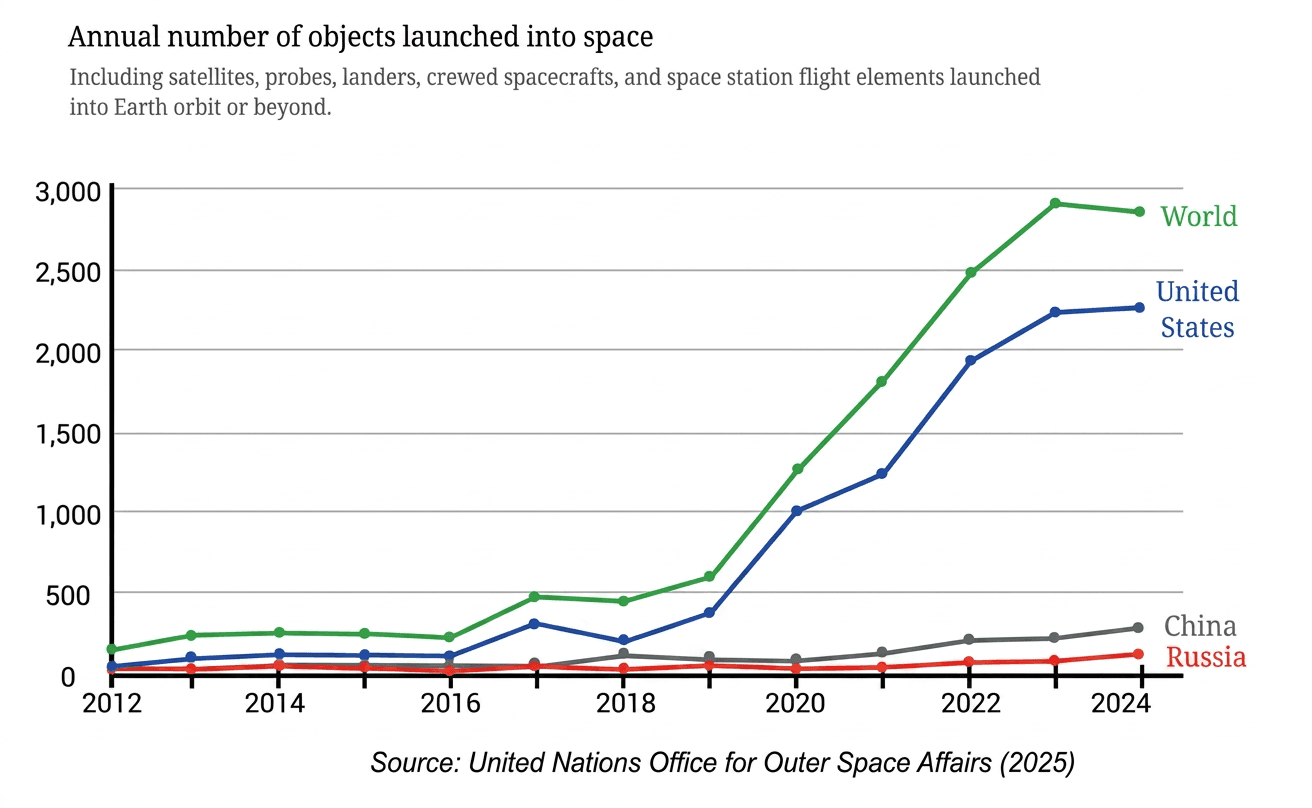
- The graph illustrates the number of objects launched into space annually from 2012 to 2024 by the World as a whole, the United States, China, Russia, and other nations.
- To analyze and interpret the data, we examine:
- Overall global trends and growth phases.
- Individual country contributions and growth rates.
- The calculated difference representing all other nations.
- Practical implications regarding orbital congestion and the "Space Jam" traffic problem.
Step 1 · Analyze Global Launch Trends
- From 2012 to 2016, global space launches remained low, ranging between and objects per year.
- After 2016, global launches experienced exponential growth, jumping from approximately in 2016 to nearly in 2021, indicating a massive surge in space activity.
Step 2 · Analyze Individual Country Trends
- United States: The primary driver of global growth. Launches were low ( in 2012 and in 2016), but rose dramatically post-2017 to approximately in 2021 and in 2024, accounting for the vast majority of all global launches.
- China: Showed consistent, steady growth from near in 2012 to approximately objects in 2024, reflecting an expanding space program.
- Russia: Remained stable and consistent at around launches per year until 2022, rising slightly to approximately in 2024.
Step 3 · Calculate Launches by Other Nations
Subtracting the launches of the US, China, and Russia from the World total in 2024:
Other countries combined contribute a small but steady share of approximately objects per year.
Step 4 · Interpret Implications for Space Traffic
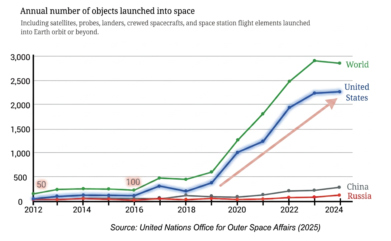
The steep rise in launched objects—driven predominantly by the United States—significantly increases satellite density in Earth's orbit. This sharp increase raises the probability of orbital collisions and debris generation, resulting in a potential Space Jam (severe orbital traffic congestion).
- Global Trend: Space launches grew dramatically after , reaching nearly objects per year by .
- US Dominance: The United States is the largest contributor, rising from in to in .
- China & Russia: China shows steady expansion (reaching ), while Russia maintains a stable level of launches per year.
- Space Traffic Impact: The rapid surge in orbital objects drastically increases the risk of space collisions and congestion ("Space Jam").
- Assuming Uniform Global Growth: Attributing the steep surge to all nations equally rather than recognizing that the United States accounts for most of the post-2016 increase.
- Misinterpreting Stability as Inactivity: Mistaking Russia's flat graph line for zero launches; it represents steady, consistent activity ( launches/year).
- Omitting Unlisted Nations: Forgetting that the gap between the World total and the sum of named countries represents the contribution of all other nations combined.
More questions in IT
Consider any 2 numbers. Find their average/arithmetic mean. Repeat this by taking other pairs. What do you observe?
Calculate and mark the mean of each collection of data below.
Can you explain how the mean is the centre of each collection?
Mark the mean for the collections below.
Verify that this holds for all the collections of data shown earlier.
Can there be more than one such ‘centre’? In other words, is there any other value such that the sum of the distances to the values lower than it and the values higher than it will still be equal?
What happens to the mean when an existing value is removed? When will the mean increase, decrease, or stay the same?
What happens to the mean if a value equal to the mean is included or removed?
Try to explain this using the fair-share interpretation of mean that we studied last year.
Explore if it is possible to include or remove 2 values such that the mean is unchanged.
You may use the following data to experiment with.
How about including or removing 3 values without changing the mean? Is it possible?
Try to include 2 values greater than the mean and 1 value less than the mean, so that the mean stays the same.
We saw what happens to the mean when values are included or removed from the collection. What happens to the mean if every value in the collection increases by some fixed number?
Consider the data: 8, 3, 10, 13, 4, 6, 7, 7, 8, 8, 5. Calculate its mean.
Now, consider this data with every value increased by 10: 18, 13, 20, 23, 14, 16, 17, 17, 18, 18, 15. What is its mean? Is there a quicker way to find out?
[Hint: Observe the following dot plots corresponding to the two data collections.]
Try to explain, using algebra, what the average is when a fixed number, e.g., is subtracted from every value in the collection.
Try to explain this using the fair-share interpretation of average that you learnt last year.
What happens to the average if every value in the collection is doubled?
Can you tell what data is in column B7?
In which subjects has Ashwin scored more than marks?
Context: Sudhakar has collected the mid-term exam marks obtained by his Grade 8 students in a spreadsheet.
Q. What formula would you type to find out the class average marks in Science?
Context: Sudhakar has collected the mid-term exam marks obtained by his Grade 8 students in a spreadsheet.
Q. Find out if the class average marks in Odia is greater than the class average marks in Telugu.
Context: Sudhakar has collected the mid-term exam marks obtained by his Grade 8 students in a spreadsheet.
Q. Show the average marks in other subjects after the last row by typing the appropriate formulae.
Context: Sudhakar has collected the mid-term exam marks obtained by his Grade 8 students in a spreadsheet.
Q. Get the total scores of each student by typing the appropriate formulae.
Context: The following figure is a clustered-column graph that shows the monthly maximum temperature in Kerala and Punjab in 2023.
Q. Now, observe the following graph. Do both these graphs represent the same information?
How do we get the maximum temperature over a month in a state?
Notice how the graph is organised, what scale is used, and what patterns the data shows.
Analyse and interpret each of the observations you made. Share appropriate summary/conclusion statements.
Here are some directions to think about —
- Why are the trends so distinct in these two states? What factors determine a region's temperature?
- You might be curious to look at the trends of a few other states. Are there other types of trends that states exhibit?
- Which states show trends similar to Punjab's? Is there anything common between these states?
Context: After analyzing the monthly maximum temperature trends for Kerala and Punjab,
Q. What thoughts or questions occur to you?
Context: Space Jam: A Traffic Problem in the Future?
Take a look at the line graph below showing the annual number of objects launched into space.
Q. What could be the possible method used to derive this data? Discuss.
Context: Space Jam: A Traffic Problem in the Future?
Step 1: Identify what is given
Q. Notice how the graph is organised, what scale is used, and what patterns the data shows.
Context: Space Jam: A Traffic Problem in the Future?
Step 2: Infer from and interpret what is given
Q. Analyse and interpret each of the observations you made. Once all interpretations are made, summarising/concluding statements can be made.
Which of the following statements are valid inferences?
- From 2012 till 2024, the worldwide count of space object launches increased every year.
- USA is a major contributor in the years 2022–24, launching about th of the worldwide count.
- Nepal did not launch any object in the period 2012–24.
- The combined count of object launches by China and Russia in 2024 is about 400.
Identify two consecutive years where the worldwide count increased by 2 times or more.
What could be the possible method to compile this data?
Mark these cities on a map of India. What is common to how they are grouped in the graphs? Share your observations and inferences about the graphs.
Identify the peak months and low months of rainfall for each city.
Read about the south-west monsoon and north-east monsoon and which regions come under the influence of these and when.
Share your observations. Based on this infographic, answer the following:
(i) The value of Karnataka is hidden. Can you guess what it could be?
(ii) Which are the top 5 states where rice is the most popular?
(iii) Which are the top 5 states where wheat is the most popular?
(iv) List a few states where the preference between rice and wheat is more or less balanced.
Context: Manoj records his activities throughout the day by colouring a strip of paper with 48 boxes, marking time in 30 minute intervals from midnight to midnight. He has recorded five types of activities for three different days of the week on three coloured strips:
(i) Sleeping
(ii) Eating
(iii) Meeting friends, hobbies, media, time with family
(iv) Attending classes, studying and homework
(v) Showering and getting dressed, yoga or exercise
(vi) Travelling
Look at the three coloured strips carefully.
(i) What activity does each colour stand for?
(ii) The three strips correspond to the days Friday – Sunday in some order. Which day do you think each strip represents?
(iii) On one of these days, he went out with friends to watch a long movie. When do you think this happened?
(iv) At what time does his school break for lunch?
(v) What more can the strips tell us?
What would your strip for a weekday look like? How similar or different is it to Manoj’s?
What would a strip of your typical day during your vacation look like? How similar/different would it look?
What would a strip for any of the adults in your family look like? Make a strip of a day for any adult at home. Compare your strip with theirs. What do you find interesting?
Share your observations on this graph. What do you find interesting?
- Referring to the graph below, which of the following statements are valid? Why?
(i) In 1983, the majority in rural areas used kerosene as a primary lighting source while the majority in urban areas used electricity.
(ii) The use of kerosene as a primary lighting source has decreased over time in both rural and urban areas.
(iii) In the year 2000, of the urban households used electricity as a primary lighting source.
(iv) In 2023, there were no power cuts.
- Answer the following questions based on the line graph.
(i) How long do children aged 10 in urban areas spend each day on hobbies and games?
(ii) At what age is the average time spent daily on hobbies and games by rural kids 1.5 hours?
(a) 8 years
(b) 10 years
(c) 12 years
(d) 14 years
(e) 18 years
(iii) Are the following statements correct?
(a) The average time spent daily on hobbies and games by kids aged 15 is twice that of kids aged 10.
(b) All rural kids aged 15 spend at least 1 hour on hobbies and games everyday.
- We all know the typical sunrise and sunset timings. Do you know when the moon rises and sets? Does it follow a regular pattern like the sun? Let's find out. The following graph shows the moonrise and moonset time over a month:
(i) Find out on what dates amavasya (new moon) and purnima (full moon) were in this month.
(ii) What do you notice? What do you wonder?